
Introduction
Every festive season, marigold garlands go up, petals are scattered with generous intent, money gets spent and the result still looks like leftover stock arranged in a hurry. That’s not a budget problem. It’s a grammar problem. Professional designers aren’t working with better flowers, they understand how colour, mass and space behave in a room.
The Six Principles
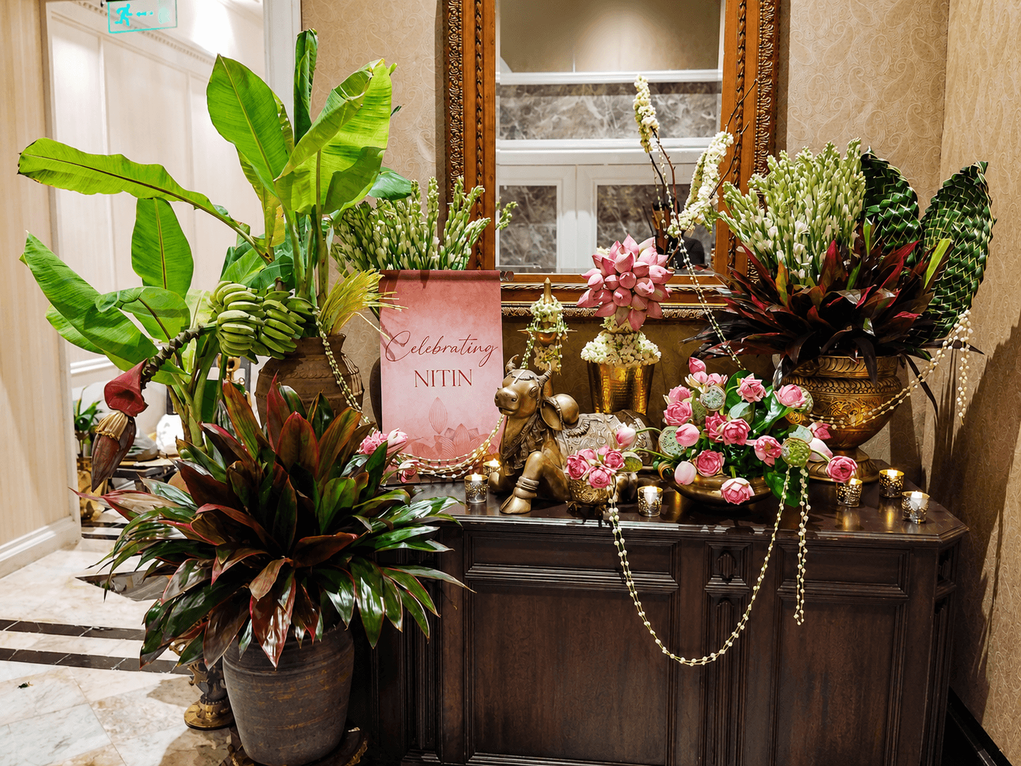
Design begins with a story, not flowers. Decide what the room should feel like and where the eye should land first, before buying a single stem. Pinterest boards fail in real homes because they were designed for someone else’s light and palette, copy the image, not the thinking and it reads as clutter.
Colour harmony creates luxury. Marigold orange and deep red are both warm, at full strength together, they compete rather than complement. A restricted palette of two or three tones, with one cooling note, reads as rich. Everything else reads as loud.
Balance beats quantity. More flowers isn’t more generous, it’s more anxious. Asymmetrical balance, a tall arrangement offset by a low, wide one, carries the same weight as symmetry without stiffness.
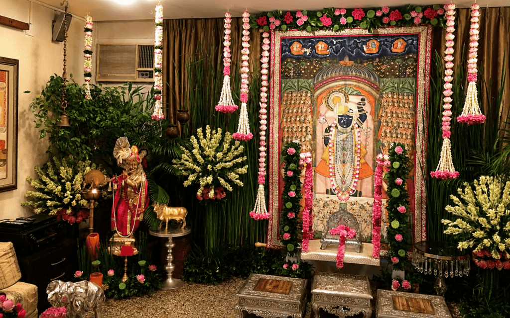
Layered texture creates richness. A single-texture arrangement reads flat. Waxy anthurium against papery rose, tight chrysanthemum against loose jasmine and foliage treated as a material, not filler, gives colour somewhere to rest.
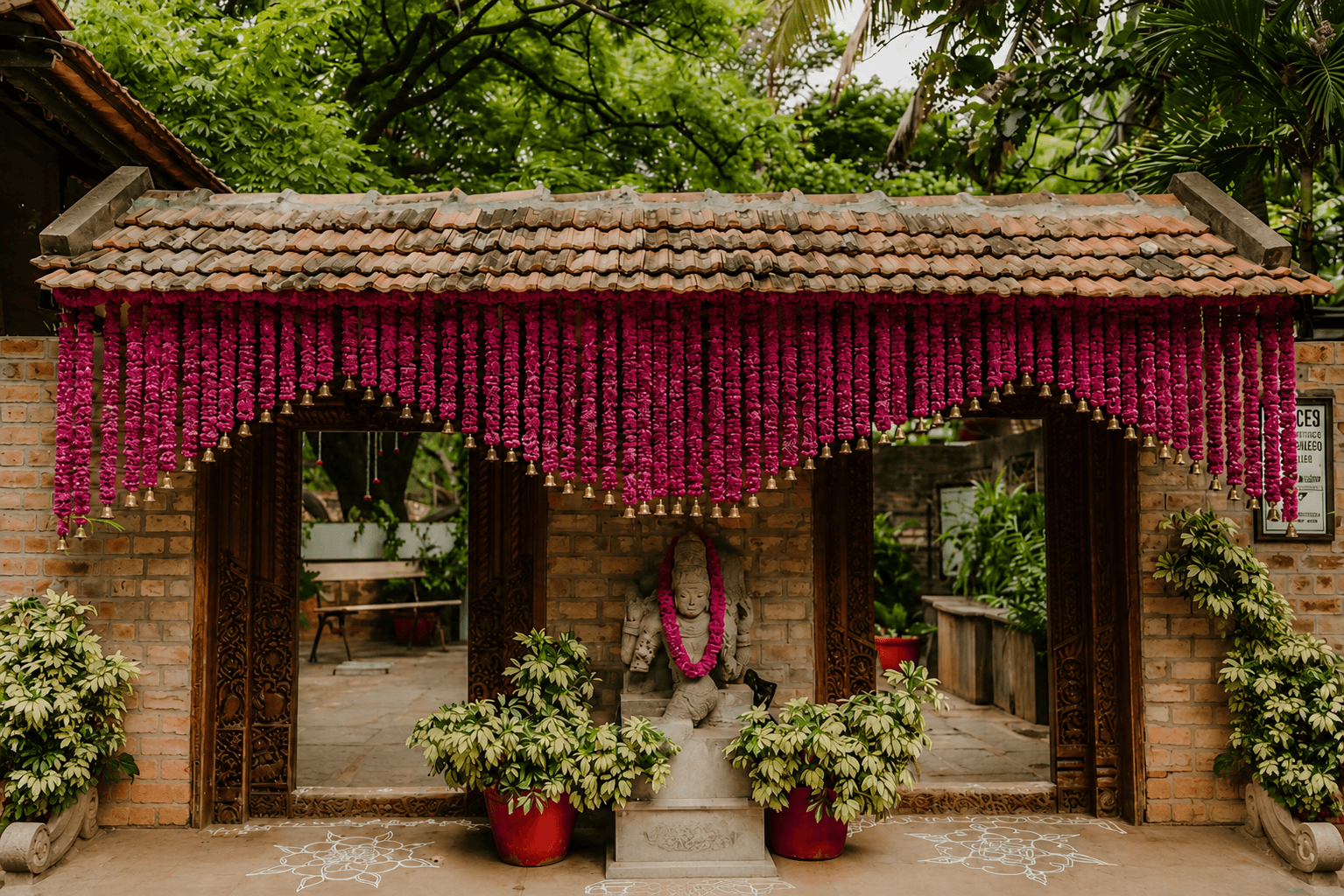
Scale and proportion matter. An arrangement should match the visual weight of its space, a delicate centrepiece on a twelve-seat table looks like an afterthought, not restraint. A double-height entrance needs vertical gestures, not just flowers at floor level.
Design with light. Warm evening lighting deepens reds and golds and mutes cooler tones, a palette balanced under shop lighting at noon can look flat by 8pm. Glossy petals like anthurium catch light and read as more luxurious under warm bulbs; matte petals like carnation absorb it for a quieter effect.
Why Doesn't My Floral Décor Look Luxurious?
Because luxury in floral design has almost nothing to do with how much was spent. A room of expensive orchids arranged without colour harmony or a focal point still reads as busy. A modest, well-balanced arrangement of marigold and foliage, with one striking anthurium, reads as considered, because what the eye responds to is restraint, not cost. Fewer flowers, placed with intention, consistently beat more flowers placed without it.
7 Common Floral Décor Mistakes Designers Notice
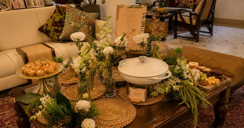
- Filling every surface. More flowers feel like more festivity, but a room with no unfilled space has no focal point, the eye has nowhere to land with any weight, so nothing reads as special. Choose two or three zones per room and commit real scale to those; leave the rest deliberately quieter.
- Mixing every festive colour at once. Marigold, red, gold and green each read as festive individually, so combining them feels like doubling the effect. Instead, four high-saturation warm tones compete for the same attention and competition reads as clutter regardless of how good each colour is alone. Build from a two-to-three colour core and vary tone and texture within it.
- Rigid symmetry everywhere. Symmetry feels safe and formal, which is exactly why it’s overused. Applied to every surface, it stops feeling grand and starts feeling institutional, a home that’s been assembled rather than lived in. Save true symmetry for singular, ceremonial moments like a mandap; use asymmetrical balance everywhere else.
- Ignoring scale relative to the room. Flowers are bought and arranged away from the room they’ll sit in, so the relationship between arrangement and space is easy to miscalculate. An arrangement scaled for a coffee table looks lost in a foyer, however well it’s arranged on its own terms. Measure the space before deciding size.
- Skipping foliage. Flowers feel like the “real” décor, so foliage gets treated as a cost to trim. Without it, colour has nowhere to rest and the arrangement becomes one continuous, tiring note instead of a composition with rhythm. Foliage is what makes flower colour legible, not what dilutes it.
- Decorating without considering evening light. Flowers are almost always chosen in daylight, but most festive gatherings happen after dark under warm artificial light, which shifts how every colour actually reads. A palette that looked balanced at noon can look muddy by evening. Check colour choices under the light the space will actually be seen in.
- Treating every room the same way. Repeating one arrangement style throughout a home feels efficient, but each room has a different function and a different amount of time a guest spends in it. An entrance is seen for seconds; a dining table, for an hour. Vary density and formality by function instead of applying one template everywhere.
Professional Styling Tips
- Start with one anchor flower. An anthurium for structure, a lotus for a mandir and build everything else to support it, not compete with it.
- Use scent deliberately. Jasmine and tuberose suit open, ventilated entrances; the same density can overwhelm a small puja room.
- Let the container set the formality. Brass and stone for grandeur, raw clay for something more grounded.
- Choose fewer, better stems over more average ones. Composition is the harder, more valuable skill than volume.
- Give every arrangement one clear focal point before placing a single stem.
A beautifully presented table increases the guest’s perceived value of the entire spread, which reflects directly on the caterer, not just the venue. A floral designer who understands hospitality operations works as an extension of the catering team rather than a separate vendor to manage.
In practice, this means:
- Styling built around the catering team’s own setup timeline
- Zero disruption during food staging or service
- Fast, quiet execution before doors open
- Coordination that understands guest flow and service stations
- One less thing for the catering team to supervise on event day
For caterers, this frees up the team to focus entirely on hospitality and service, while the table still looks like it was designed by someone whose full-time job is floral design.
Frequently Asked Questions
Why does my flower decoration look cheap even when I spend more?
Because cost isn’t what the eye reads, composition is. Four competing colours, every surface filled, no focal point: these read as clutter at any budget. A restricted palette of two or three tones, real negative space and one clear anchor arrangement will outperform double the flower spend arranged without intention. The fix is editing, not adding.
How do you make a floral décor look luxurious?
Start with a story, not a shopping list. Decide where the eye should land first, restrict the palette to two or three tones with one cooling note, layer textures so colour has somewhere to rest and scale each arrangement to its room rather than to the table it was built on. Restraint, consistently applied, is what reads as expensive.
How many colours and flower varieties should festive décor use? Two to three colours as the core, with tone and texture varied within them and three to five flower varieties for most home spaces. Marigold, red, gold and green each read as festive alone, combined at full strength, they compete rather than compound. Depth comes from texture, not from adding more colour.
Which flowers last longest for festive decoration?
Chrysanthemums, anthuriums and orchids hold reliably across a multi-day festival. Marigold performs well with basic care. Tuberose, jasmine and delicate roses are single-day flowers, use them where scent and freshness matter on the day itself, not in installations expected to survive the week.
How do I keep floral décor fresh through a week-long festival?
Keep arrangements out of direct sun and away from heat sources, mist garlands lightly and refresh water in vase arrangements every day or two. More importantly, plan for it: build a durable structure from long-lasting blooms and schedule a mid-week refresh of only the delicate elements rather than replacing everything.
Are fresh or artificial flowers better for festive décor?
Fresh, in almost every case. Natural colour variation and genuine fragrance are precisely the qualities that make décor read as considered rather than assembled. Artificial earns its place only in long-duration installations, waterless spots or structural elements no fresh stem could survive, ideally hidden inside a composition that leads with fresh.
Is professional floral décor worth it over doing it yourself?
Depends on the occasion’s weight. The skill you’re paying for isn’t access to better flowers, it’s composition: colour discipline, scale judged against your actual rooms and palettes checked under the light your guests will see them in. For a daily arrangement, do it yourself. For the occasion photographed and remembered, composition is the harder skill.